
MLP jerseys lack a clear identity
I love MLP, but the uniforms miss the mark.
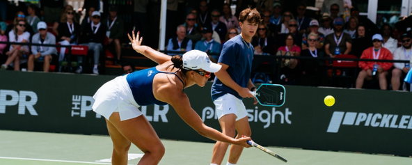
Most of them feel more like overloaded soccer jerseys, and not in a good way.
There are so many logos crammed onto each shirt that the team name and identity get completely lost.
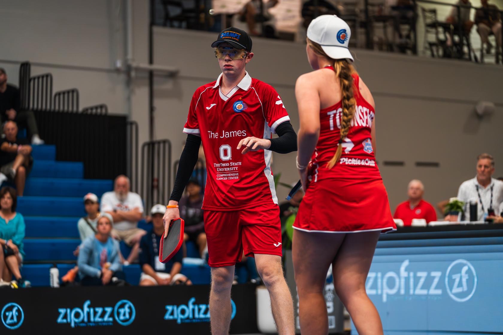
Is it The James at Ohio State playing, or the Columbus Sliders? It’s honestly hard to tell, and that’s a problem. If fans can’t instantly recognize who’s on the court, it’s tough to build a real brand, a loyal following, or a culture people want to buy into.
I like the Georgia peach color for the Atlanta Bouncers, but right now it looks more like the Stella Artois team took the court. At a glance, I have no idea who’s actually competing.
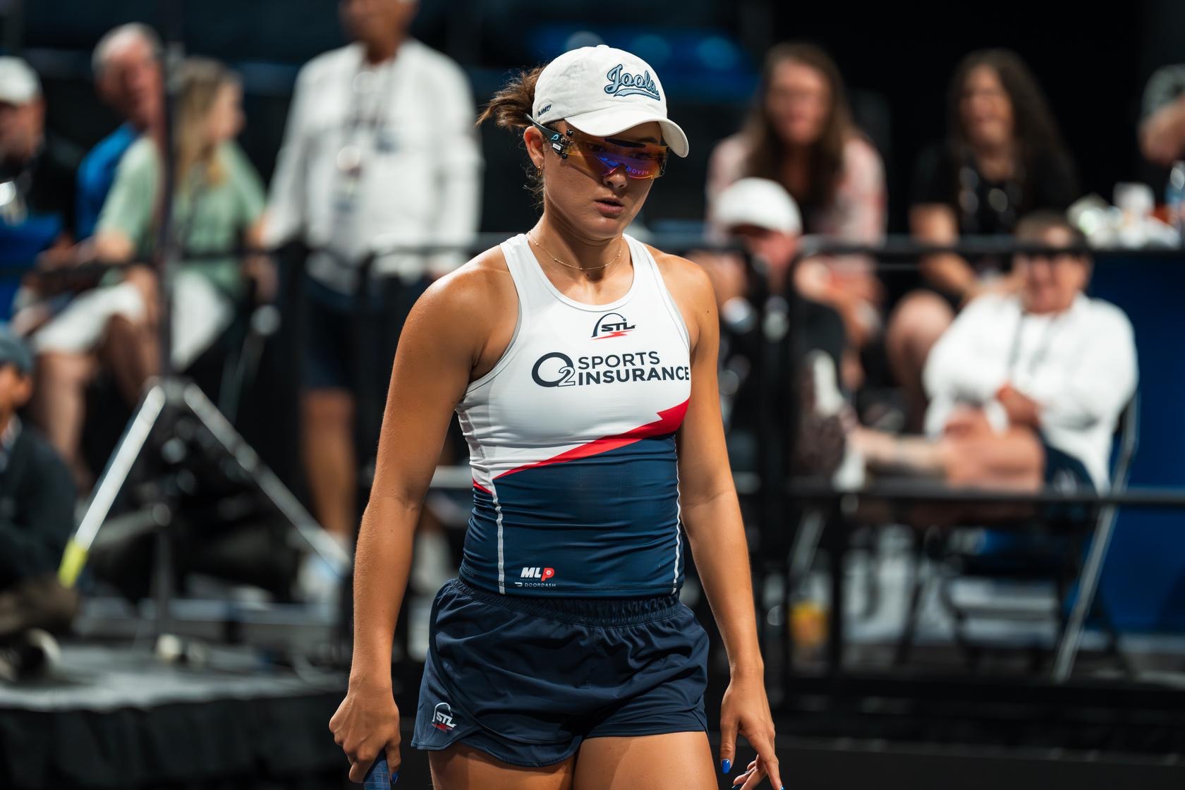
Take Anna Bright’s fit from MLP Columbus. The color blocking works, and the bright red lightning bolt is a nice touchm, but none of that stands out. All I see is O2 Sports Insurance.
In soccer, overloaded jerseys work because the teams are already iconic. Everyone knows that light blue means Argentina. But MLP doesn’t have that kind of built-in recognition yet.
Right now, the sheer number of logos is taking away from what could be really clean, sharp uniforms.
And then there’s the constant color changes. That part makes it even harder to follow. One day the Bay Area Breakers are in red and blue, the next they’re in white, and then suddenly turquoise in the finals. As a viewer, it’s confusing, and as a fan, it’s hard to even know what colors to wear to show support.
When every team is switching it up at every event, it creates a disorienting experience. You turn on Pickleballtv and it’s genuinely difficult to tell if you’re watching the Shock, the Sliders, or the Fives.
The one team that gets it right is the Orlando Squeeze. Every time they play, you instantly know it. The bright orange might be loud, but it’s unmistakable, and that’s the point. If someone’s wearing orange in the stands, there’s no question who they’re backing.
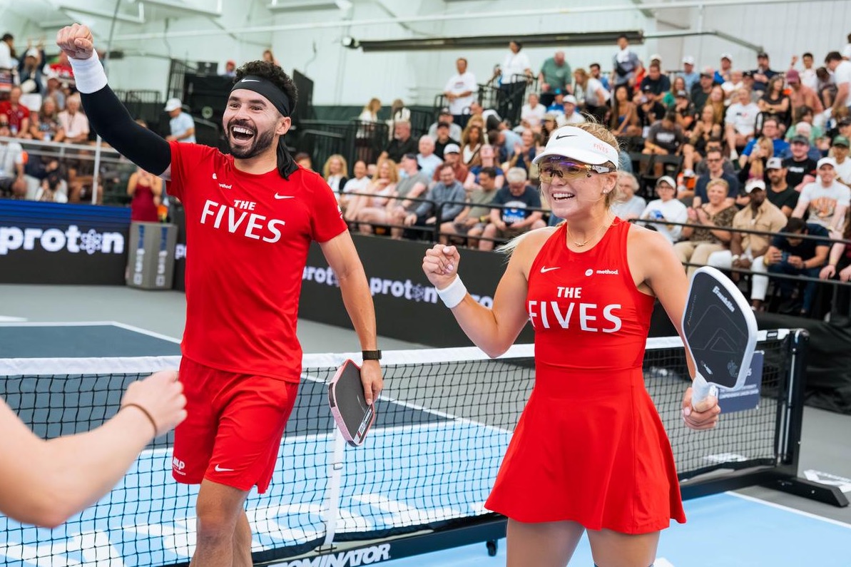
Personally, I think the Fives should lean all the way in and make bright red the identity. Every uniform should feature that bold color. It pops, it’s memorable, and it actually ties into the red-nose clown logo.
That’s the bigger issue across MLP. Every team should commit to one or two core colors and stick with them, just like in college and pro sports. I’m from Florida. You’re either garnet and gold or orange and blue. Those colors mean something.
Look at Michigan’s “Go Blue.” That maize and dark blue combo is instantly recognizable. You know the team, the fans, and the tradition the second you see it.
MLP needs that same level of clarity. Right now, too many teams feel like they’re still searching for an identity.
Take the Miami Pickleball Club. I’ve always loved their vibrant, coastal color scheme. They should fully commit to pink and turquoise. Instead, they dilute that identity with navy, black, and designs where pink barely shows up. When they do that, they end up looking like every other MLP team in my feed.
And from a fan perspective, it makes it harder to show support. Teams need a clear, consistent two-color identity, just like in nearly every other sport.
So here’s my plea to MLP decision-makers: simplify. Find a cleaner way to incorporate sponsor logos, or cut back on them, and commit to two defining colors. Make it easy for fans to recognize teams and feel like they’re part of something. Because right now, it’s all over the place.
To keep up to date on all things pickleball, follow us on Instagram.
Related articles
Bucket hats spark full-blown fashion debate in pro pickleball
Connor Pardoe’s viral take ignited a notable style vs. substance conversation online.
5 hours ago
-Victoria Radnothy

How J. Pritchard designed the LA Mad Drops' MLP uniforms
Steve and Darren Gable take us inside the creative process.
1 day ago
-Victoria Radnothy
The pickleball courts that turned Pittsburgh into an outdoor art gallery
I've seen a lot of beautiful pickleball courts, but these might be my favorite yet.
1 day ago
-Victoria Radnothy
Mixed doubles outfit ideas: What to wear on the pickleball court
Easy, repeatable outfit formulas you and your mixed partner can make your own.
1 day ago
-Victoria Radnothy