
Rebrand alert: MLP's Florida Smash elevate their merch
The Florida Smash unveiled a new logo and fresh merch with MLP Austin on the horizon.
I was a little indifferent to the Challenger Level team's previous creations in these departments. The branding and apparel certainly wasn’t the worst of the worst, but it didn’t really standout from a positive or negative standpoint either.
My favorite version of their uniforms are definitely the matching green sets with the simple white font that read “Smash” across the chest.
Not good, not bad. Just fine. They didn’t scream pickleball, but it also wasn’t covered in logos (unlike some other MLP jerseys…).
That being said, if you take a look at where the uniforms started, there hadn’t been many updates or changes over the years.
But finally, the Florida Smash did a rebrand - and this is a step in the right direction.
The squad has been teasing this new drop for several days, and on May 20 we finally got the full reveal, and I was pleasantly surprised.
Let’s talk about the logo.
The previous iteration that simply said “Smash” is gone and replaced with a unique sunburst design that doubles as an accelerating pickleball. The color is deep orange, and complements the existing white and dark green color pallet. Overall, it’s coastal with a vibrant edge that is a great update from their previous version.
They also updated the Florida Smash font and elevated the simple font to a more memorable design that just adds a little extra visual interest.
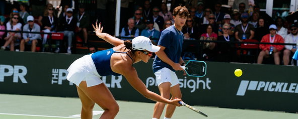
In addition to new merch, the Smash will also debut new uniforms in Austin.
My big problem with MLP teams is that there’s very little differentiation when it comes to team uniforms. For the majority of last season, it was as if all the teams had an identity crisis. There was no clear cut uniform or team colors that they consistently stuck to. The Columbus Sliders, for example, would wear blue on Friday, white on Saturday, and red on Sunday. And their logo or brand had absolutely zero red, so where on earth did the red come from? Your guess is as good as mine.
The Orlando Squeeze was the only team where viewers could undoubtedly and easily tell when they were on court because their uniforms always featured a lot of orange. But for the rest of the teams, it was a genuine toss up.
And when the majority of teams have frequent colors they use like black, white, red, and blue, when I’d tune into Pickleballtv, it always took me way too long to figure out which team was playing.
I'm glad to see more MLP teams rebrand and add some variation to help their team, logo, and merch stand out. Now, I’m even more curious to see what their uniforms will look like at MLP Austin. But, if they look anything like the rebrand, I can assume they will be sleek, modern, and cool.
What do you think of the rebrand? Let us know your thoughts on Instagram and X (formerly Twitter).
Related articles

How J. Pritchard designed the LA Mad Drops' MLP uniforms
Steve and Darren Gable take us inside the creative process.
2 days ago
-Victoria Radnothy
Mixed doubles outfit ideas: What to wear on the pickleball court
Easy, repeatable outfit formulas you and your mixed partner can make your own.
2 days ago
-Victoria Radnothy

Mixed doubles style guide: Top brands to shop
From premium picks to budget-friendly finds, these are my go-to brands for men’s and women’s pickleball style.
3 days ago
-Victoria Radnothy

Which pickleball paddle should I buy? Find the best paddle for your skill level
Choosing the right pickleball paddle can dramatically improve your game.
3 days ago
-Guest Author